'Costa' Shoot.

Introduction.
I shot my images in the same place as my test shots as I liked the way they came out. I asked permission before I began my shoot and I took the images in a Costa Cafe just on a table with the plush seating in the background. I struggled with my main concept of capturing movement using a slow shutter speed. I used a tripod to ensure a sharp image, but when I tried to show the movement, the camera just captured and image that looked as if a hand was accidentally waved in front of each shot. I wanted to show the movement of sugar falling, milk pouring into the cup and then finally the stirring action. I was disappointed with my results, if I had had any extra time I would have tried again in the studio. Below is my contact sheet for this shoot.

Conclusion.
Overall, I think my shoot went well even though my main concept didn't work out how I had hoped. I still think I have some strong, usable images. I re-shot my test shots as planned and I think these worked well. I will only edit these images slightly by adjusting things like colour balances and possibly boosting contrast slightly - I will explain the editing stage when I have finished this.

Test Shots.

Introduction.
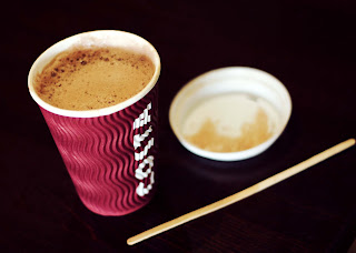
For my test shots I wanted to use a product inside the cups, but the only access to a product, would mean I had to purchase one. I therefore decided that for the purpose of my test shots, said product could stay put in the cups I bought them in. They also doubled up as research pieces, and meant my cups wouldn't get messy from the purchased beverage.


Include Product.
For my images, I want to use a product like the one I used in my test shots, as I liked both the texture of the froth, and the way it contrasted with the white inside of the cup. I also think this fits the brief in the aspect of showing how their products can be used. I considered using a square formatted image, but the brief isn't completely clear as to whether this would be an acceptable format. I therefore am going to stick to standard formatting. I really like the image below and is one of the ones I'd like to re-create. However, I do not think it would be as effective in a standard format. I could use the concept but would have to recompose the shot with different angles.


Including Some Background Information.
I tried to produce an example that included some background information, but I aimed to avoid a busy backdrop as the important part of the image is the actual product. I used an aperture of 1.8 to get the blurred effect. I think this helps keep the focus on the subject. I like the effect it gives with the shallow depth of field.


Alternative Square Format Example.
I produced a second image from the previous photograph before I decided against using anything other than a standard sizing. This shows the difference between having more or less background 'information'. I like the colours more in this second image as I think they compliment each other better. I think I may go back to Costa to do my shoot instead of using the studio. If I have time I will also take photographs in the studio in addition to the ones in Costa.


Images Including Accessories.
I like these images because of the dark background. It gives a good contrast to the product and makes it more dynamic. It reminds me of the images by Edward Weston where his images also showed a dark backdrop. I like the second shot the best out of theses two, but the content may look better visually if it was lightened slightly. I like the texture of the corrugated cups, as I think it adds to the overall look visually. I think I will try to reproduce 


Uniformed, Documentary Style 
This image, again reminds me of Edward Weston's work because it had a uniformed, documentary feel to it. It has a similar use of space around the edge and has a dark background like the images he created. I feel this is one of my strongest test shots and I would like to re-create it in my shoot. Again, I like the texture and contrast of the cup, this is due to the lighting and actual shape of the product.

Conclusion.
Overall I think I created some good images in during my test shoot, and I would like to try and recreate a few of them as well as trying out some new ideas talked about in my initial mind map. The main new concept I would like to try is movement.

Huhtamaki.com

I was disappointed with the amount of information on the company's actual website. Currently, there is a limited amount of text to go along side the food-service section of their website that the paper cups feature in, the only bit that really stood out was that they want their products to reflect the same high quality of the product inside them.

They also have a very limited amount of photographs on their website of their paper cup products, so it's hard to define a definite style they like; but on the plus side, any style I use will be a fresh look for the company. The only current photos of the selected product are the ones below:


The image I prefer out of the two is the cups on their own as the other is a little busy in the background; making it distracting from the actual product. It also doesn't really show the product in it's typical use - as it looks more like a house than say a business cantine; which I feel is a more typical use. I think the first image also looks better with less; or nothing, in the background as it looks more professional for their website. I shall try to keep my backgrounds as simple as possible. I think I will use a wide aperture if possible to also 'force' the focus of the image onto the product.

Simular Products, Different Companies.

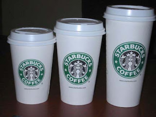
To begin with I only looked at products photographed on the internet, I tried to find a section on the Starbucks and Costa coffee website on 'take-out' beverages, but had no success. Therefore my research on how other companies display their products had to be explored in a different way.


Luckily, despite previously thinking I didn't have the time or money to collect samples of simular products, I found ways around these issues such as the use of tokens. I had gathered a small collection of simular products earlier today to photograph as other examples to analyse. I purchased a mocha from Costa along with a tea from our college canteen. A friend also helped me out with a full "buy 6 get one free" McDonalds card, this enabled me to collect another sample from this suppler. Including the images I found on the internet of the Starbucks cups, I now have four examples of simular products: Costa, McDonalds, PG Tips and Starbucks.

Most of the products; like two of the Huhtamaki products, have some form of corregated card included in their design. The tea from the canteen wasn't made of this material, but it has a corregated sleeve that fits around the smooth cup. I believe this material is used not only for added grip, but also to help prevent the user from burning their hands. All of the corregated cups have miminal design added to them, which I think is good for photography because they already give a texture to create pattern. The smooth cups tipically have much more design work on them.


All of the lids had a very simular design which included a small hole to drink from and a dip behind it to catch any excess liquid. All of the lids were white, and I have never seen a black lid until today, which was included in the sample pack Huhtamaki sent for photographing. Some of the lids have 'bubbles' you can press down to indicate the content of each cup, which is useful for multiple purchases.

Edward Weston Still Life Research.


Introduction.
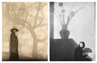
The bulk of Edward Weston's work is set out in a uniformed manor. He uses monotone widely, and typically centres his subjects within the frame of his shots. A lot of his work seems to explore the visual textures of inanimate objects; mainly vegetables and shells. I think that this documentary feel could work with my own work, so I have chosen to explore his work in this section.

Visual Textures, Shapes and Contrasts.
I like the textures in these images and the way in which they are focused on. I think the different shapes and textures adds interest to the images. A lot of people wouldn't consciously look at the texture of an object, but these images force the viewer to take note of this factor. Although I think this is an interesting concept, I believe that this wouldn't work in my own images; because to make the style work, I would have to take a close up shot to address the texture rather than the product; this would not fit the brief I have been given, so I will not use this technique in this particular assignment.


Uniformed Layouts.
I like the feel to these images, as to me they come across as organised and gives a minimalistic feel to them. It also makes you focus completely on the subject itself; which if I used this style in my work, would be the chosen product. There would be no confusion on the subject at all; so this is a possible set up for my own images. As a variation to this idea, I could try different angles so the images are slightly offset instead. I also really like the dark backgrounds in the images. I think this could either work well in a way it would make the product stand out, or it could potentially take away from the effectiveness as it may give the image a dark gloomy feel when coffee shops (the most typical target audience) are usually bright and fresh feeling, or slightly dark, but with a cosy feel. I will try this out on my test shots to decide whether the dark background works effectively or not.
Extra/Extra Thoughts - Shadows.
When I was looking through the work of Edward Weston, I found these two pieces which led to a new idea. I could take a picture where the image is lit from the front and a large shadow is consequently  formed in the background. This could possibly show how the products are of good (or 'big') value; I would have to work on this idea to make sure this concept was clear. I believe it may be hard to 'concrete' this concept into my images clearly without text; so unless I find a really clever way to do this, I think I will use some of my other ideas.


Conclusion.
I like the way he photographs his subjects; it's simple, yet effective. I think his work has an organised feel about them with the documentary photography styled set ups. Although I love the strong contrasts created by the use of monotone photography, I think for my work it would be much easier to create an effective shot in full colour; but I will try out this style of photography in my work without the monochrome - if only in my test shots; but I am really fond of this style, and it isn't one I have used widely if at all. I will also try out images with dark backgrounds to see whether a dark background would add or take away from the image for my final photographs.

Still Life Research on Irving Penn.

Introduction.
I have decided against using a model in my work as they can be unreliable and sometimes hard to organise at such short notice. I want to limit potential problems in this assignment early on, so because this is a short assignment, I plan to produce still life images only. I have therefore, only looked into still life photography for my artist research; my first section explores still life work by Irving Penn.

Placement & Shape.
Irving Penn shows a good understanding of placement within his images and I would like mine to do the same. It is essential that the subjects within a photograph are arranged correctly, otherwise your image may not give the right feel you're aiming for, or could come across as bland and uninteresting. The positioning of different shaped objects, heights or width can also help the eye flow across the image in a variety of different ways to direct the eye to the desired content. Below are some examples of Penn's work which shows the aspects discussed above. I personally really like the placement in these images, especially the ones involving the chess piece, and the image with the spoons. I think they work because of the variety of visual textures, shapes and the overall arrangement of the individual props within the shots. Each prop adds to the shot because of their careful positioning rather than cluttering the shot up. I would like to do the same with my images. I have noticed that in Irving Penns work, he often leaves a 'margin' around his subjects; maybe this adds to his images in some way - possibly this use of space prevents any feelings of a cluttered image. When I carry out my shoot I will consider the use of space within my images to avoid producing over-busy photographs.


Colour Placement.
Penn also uses good colour placement within his work. When colours become concentrated in one area, or there is a lack or clash of other colours featured in your image, it can become distracting for the viewer; sometimes, however, you may want this effect. In general it is something to either be avoided or, occassionally something to be harnessed to force focus onto a specific subject. I like these examples because of the placement of the colour red in each example. The dynamics of the bright, red colouring against the less vibrant and blander accompanying colours, make the red subjects the focus of each piece and enhances the colour contrasts. My products aren't as bright as the ones used in Penn's work, but I can consider this in my own work, or I can encourage this effect in Photoshop by subtly adjusting the vibrancy of different aspects of the images.


Misc/Extra Thoughts.
I found this image when gathering research images for Irving Penn and it didn't fall under the above catagories, but it gave me a new idea; I saw it and thought I could look at the recyling aspect of the cups, I would have to work on the concept if I chose to take it further, but I could replicate a simular image with the given products. The problem with this would be that I couldn't re-use the cups if I thought of an improved idea afterwards. I would also have to use some other props to make the concept clear.


Conclusion.
The aspects explored in this section, is essential within still life photography. When I do my own shoot, I must carefully set up my shots to make the products look as interesting as possible. I must consider the visual textures and colours involved in the image, along with different shapes, sizes and spacing. These must be arranged to best compliment each other, and I will do my best to consider this when producing my own work.

Research Mind Map.

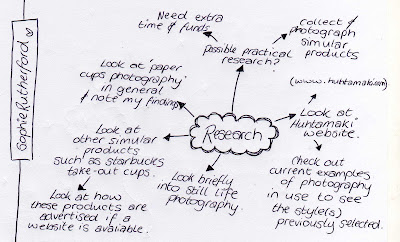
In response to my concept ideas produced in my first mind map, I have created a second to outline areas to explore in my research section of this project. I have decided to not only look at the photography side of the work, but also to look at the company itself, and their potential target audience so that I can best develop an idea to suit the given brief. I would also like to collect some further samples of other similar products,  so I can photograph them and use them in my research, but unfortunately I have neither the funds or the time with the assignment being set as a short project. I have included this in my mind map anyway to show that I have considered the further research.

Concept Mind Map.

To outline my initial ideas and potential concepts, I have organised them into a mind map to show how my ideas link together. I have tried to think of the purpose of the images as well as the design properties of the photographs. It is essential to remember the audience of the image and not just focus on the design side of the photograph. The purpose factor and design factor of the photograph, each have the potential to lessen the effectiveness of the other. Therefore I have decided that a compromise between the two is necessary to make the overall impact of the image more effective for the target audience; Huhtamaki.

Introduction to Capturing a Cup.

For this assignment we have two days to produce and submit a minimum of three images into a competition run by and for a company called Huhtamaki. All of my work for this assignment is to be recorded, evidenced and analysed on this blog.

The company running the competition, produce plastic and paper packaging for food and beverages sold by other companies. The product I am looking at are paper cups that allow customers to take hot beverages out of their local cafes, restaurants, hotels, and other catering facilities, away with them. The images will be used by the company in a variety of ways for their food service trade PR and advertising activities.

The aim of this assignment is to create creative and striking shots that show the use of their different paper cup products. These cups can be used for a variety of beverages ranging from your basic coffee, tea and hot chocolate, to their more fancy and indulgent versions - and even smoothies or milkshakes; but mainly hot drinks. The cups allow you to take the products away from their stores and stalls, which makes life easier for people on the go such as customers wanted to get their caffine kick-start in the morning on the way to work. The cups also include plastic lids that help prevent any spillages as well as cup holders which make multiple purchases easier to carry.