Introduction.
The bulk of Edward Weston's work is set out in a uniformed manor. He uses monotone widely, and typically centres his subjects within the frame of his shots. A lot of his work seems to explore the visual textures of inanimate objects; mainly vegetables and shells. I think that this documentary feel could work with my own work, so I have chosen to explore his work in this section.
Visual Textures, Shapes and Contrasts.
I like the textures in these images and the way in which they are focused on. I think the different shapes and textures adds interest to the images. A lot of people wouldn't consciously look at the texture of an object, but these images force the viewer to take note of this factor. Although I think this is an interesting concept, I believe that this wouldn't work in my own images; because to make the style work, I would have to take a close up shot to address the texture rather than the product; this would not fit the brief I have been given, so I will not use this technique in this particular assignment.
Uniformed Layouts.
I like the feel to these images, as to me they come across as organised and gives a minimalistic feel to them. It also makes you focus completely on the subject itself; which if I used this style in my work, would be the chosen product. There would be no confusion on the subject at all; so this is a possible set up for my own images. As a variation to this idea, I could try different angles so the images are slightly offset instead. I also really like the dark backgrounds in the images. I think this could either work well in a way it would make the product stand out, or it could potentially take away from the effectiveness as it may give the image a dark gloomy feel when coffee shops (the most typical target audience) are usually bright and fresh feeling, or slightly dark, but with a cosy feel. I will try this out on my test shots to decide whether the dark background works effectively or not.
Extra/Extra Thoughts - Shadows.
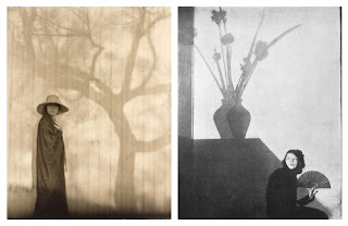
When I was looking through the work of Edward Weston, I found these two pieces which led to a new idea. I could take a picture where the image is lit from the front and a large shadow is consequently formed in the background. This could possibly show how the products are of good (or 'big') value; I would have to work on this idea to make sure this concept was clear. I believe it may be hard to 'concrete' this concept into my images clearly without text; so unless I find a really clever way to do this, I think I will use some of my other ideas.
Conclusion.
I like the way he photographs his subjects; it's simple, yet effective. I think his work has an organised feel about them with the documentary photography styled set ups. Although I love the strong contrasts created by the use of monotone photography, I think for my work it would be much easier to create an effective shot in full colour; but I will try out this style of photography in my work without the monochrome - if only in my test shots; but I am really fond of this style, and it isn't one I have used widely if at all. I will also try out images with dark backgrounds to see whether a dark background would add or take away from the image for my final photographs.


No comments:
Post a Comment