RUT BLEES LUXEMBURG (26.01.2011)

I absolutely love Rut Bless Luxemburg's work; I think it is stunning, the colour tones of the images, the milky feel to them, and the luminosity of her work is just incredible. When she was a guest lecture at Burton College, she showed her work on slides rather than using a projector and they look even better on slide. She works on film as she finds it is better for the night photography that she often produces. She also works with a large format camera for resolution as she often creates 8ft prints.

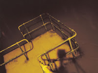
In 1995, when she studied at London College of Communication, she worked around London. She didn't want to capture the well known landmarks of the city, and wanted to show a different side of London's character though her photography, so she ventured out to find other subjects for her work. A theme she created for herself was to take images from a high perspective to hopefully achieve what she called a "speedy look, and to give the feeling of vertigo". The image opposite is one of five in a series, one of which she sold to a record company to use as an album cover.
After this cover, she was soon commissioned by the band 'Bloc Party' to create an album cover for her; I think this shows and backs up the fact that one job can lead onto another like Jon Burgerman and Studio Output discovered. Opposite is the cover she produced for them. I really like these pieces as I personally love the way she has showcased how beautiful light is at night. Although the light movement shown in her photograph for this album was slightly risky in the sense of being slightly cliché; I find that the piece works perfectly for it's purpose.

Going back to her sky scraper series, she was asked by a feminist art collector to make a project for public viewing. These images were presented in a way to show off what I would agree to be "luminocity". Luxemburg showed her work in the dark and illuminated them using back lighting. She exhibited in a similar way to Julian Germain as she also presented her work on the street. One example of where she presented her work was a dark walk way under a bridge; the idea was to make the areas appear more friendly for people using them.

As a photographer, Rut Blees Luxemburg doesn't like to edit her images, but this image opposite was an exception; originally there was a 'Coca-Cola' logo on the side of the container. For the purpose of visual communication, she removed this branding to make her image have less distractions from what she wanted her work to say. She intended this image to represent an "intimate place; a small place to create".

Another piece I cannot source included several elements to represent what she saw as security; there were leaves in the image which she feels are meant to represent a blanket, and the barbed wire and security camera are to keep unwanted threats away. I like the way that lots of elements in her photography means something to her, and each one has a representation that adds a story to her work.
A photographer that influences her as an artist is Jeff Wall, she likes the idea of water in her photography, and he talks about the water-photography relationship. Luxemburg believes that to take water and freeze it, is to be a sign of femininity. I think however, that she is influenced in a different way as he doesn't tend to use water in his photography. I think that they have similarities because both use additional objects to show a hidden meaning to what could be 'just a photograph'.

Jeff Walls - Understanding Joshua
For example, this piece opposite by Jeff Wall is entitled "Understanding Joshua".  I can see how the woman seems to be taking pity on the man in the image; but I can also see an additional represent of each person in the image. The horse ornament is a representation of the beautiful and strong, confident, woman in the photograph, which contrasts with the second ornament; a pig which represents the man. To me, I think this shows the low esteem of the man's own personal opinions of himself and the distress caused by this is clearly shown by his body language. I think that elements of these additional factors in the image have influenced Rut Blees Luxemburg as she is consciously aware of the representation within her work though the presence of certain objects. I think this shows that you can completely change the feel of an image with visual metaphors. I also like how subtle they are in this image, yet at the same time, literally highlighted. I think that these subtle touches to these artist works really transforms them and adds further all important interest to the pieces; who would look at a boring photograph for any length of time and remember anything about it?

Other interests are clearly shown in her work; nature, specifically water, as already discussed. She created another series of work that involved shooting things in the reflections of puddles. Sometimes she would create puddles to get the shot she wanted. I think this is, although obvious when discussed, more initiative than other artists; she doesn't just wait for photographs to appear in front of her and get her camera out; she creates them. I think this shows a small proportion of her dedication to her work.

Another factor that you can see in her work is structure and architecture; she said she finds herself attached to unfinished buildings as she likes the way they have no beginning or end. I like this detail in her work as I think that the shapes are a good visual to in take. The image opposite is a strong example of this; I find it gives a feel of vertigo as well as having a strong visual structure due to the composition of the block shapes and lines within the frame. This is an image she has turned around to make more interesting and stir emotions; this is intended to give the feeling of free fall. I would say that it gives me the feeling of vertigo; so I would agree with this statement.


All in all, I really do love her work; some are simply just beautiful, whereas others are taken even further and have strong verbal communications with you as a viewer through the use of having certain representations in shot to create visual metaphors. I think this further shows the importance of visual communication and having a connection with the viewer through this tool.

JULIAN GERMAIN (12.01.2010)

The work of Julian Germain seems to have a theme of wanting to give some kind of message to his viewer. In 1995, he went to Brazil and started a project where he worked with street children. He gave them all cheap 35mm, disposable cameras with a flash, to take photographs of whatever they wanted. The group of children and Germain would meet up every one or two days to review the photographs taken. By carrying out this project, he managed to document the lives of these people.  


To show people what their lives were like, for better understanding, and any potential help to be gained for these street children, an exhibition was arranged in 2002. This wasn't any ordinary exhibition; he printed large posters of these images and put them up in the streets where people couldn't ignore them, and where no effort was needed to view them. They also made newspapers with their photos in and handed them out for free. The posters made were sold for £150.

I think the way Julian Germain presented these images shows his intelligence; not many people would have seen them if he had held an exhibition that people had to attend. Unfortunately people are blind to what is going on around them, and often don't care enough to notice; by shoving these photos underneath people's noses, many more people would have got to at least see them photographs, and opinions would have been more likely to develop in more people's minds. I think his exhibition was clearly a success if he sold the works of the street children for £150.

Germain says that he wanted the photographs to represent the people in them, and to show "that these people are capable of expressing strong, intelligent feelings and deep human emotions". These images not only document and record the life style of the people within the works, but has a strong meaning and message to them. They show courage, resistance, deprivation and inequality of the world. Germain got people discussing these issues, and educated more people about what was going on around them.

Overall, I would say that Julian Germain's work is a good example of photographic media, because the visual communication of the work is so strong. I think from his work, you learn how important it is for your images to have some 'visual voice' to call out to the viewer and say something; even if it doesn't matter, you're photographs should just say something. I think that this work contrasts strongly against Joe Cornish's pieces; they don't say a lot at all, they're just picturesque - documentary at a push. I much prefer this body of work because it has a non-fiction story to grip you, and it has an important message to you as a viewer.


JOE CORNISH (08.12.2010)


Joe Cornish specializes in landscape photography, which I usually wouldn't look at as I don't particularly favour this genre. However, I think that these images have been produced really well. I think they are visually attractive because of their colour casts; I think this adds a soft fantasy feel to them and remind me of how heaven is depicted with the pale blue and pink tones across the clouds. I think Joe Cornish has selected some interesting scenes to photograph as they hold good visual texture like in this first example.


I also find this photograph compelling as I think this scene is another example of a picturesque and I also like the symmetry of the piece. I don't feel that his work really says a lot other than being visually attractive images; they don't have any visual communication or connection with the viewer. I could see these images being used in frames as example pieces in shops like IKEA.

I like the colours in this image as I feel they compliment each other well. I think the shapes and lines in this image is what makes this image interesting. I like how there are different elements with the frame. The line created by the water's edge works as an effective way to break up the image; without it I think there would have been too much block colour and texture of just sand. I think the rocks in the image look good because of there positioning; whether or not the photographer has done this himself, or if this is just natural alignment, I don't know. I like how these rocks are only in the water because it appears to be deliberate.
For this image, I find that it works because of the grass in the image and the way it is broken up by the sand. This grass element is crucial to this image as it is the most interesting factor within the composition; this is because of the visual texture included for the eye to take in. I also find the sun set in the background works well because it draws the eye through the image.
I like this image for similar reasons to the second image; they are obviously a like - maybe a set. I think I prefer this image because it has a lighter feel to it. I like how pure the water looks within the composition. The rocks add a good tonal range, and I think without it, the image could have looked pretty flat. The only visual message that I could probably make from this image, is maybe about being free; the water flows into the distance and looks free spirited. I find this a very forced meaning to create from the image however, so I don't find this to be a very strong or meaningful message.

Overall, I would say that I don't like this work as much as the other artists I have looked at because I don't find they really 'speak' to me visually. I find this makes the images, in my eyes, unsuccessful. The only thing I can see these images being used for is solely to sell to people as art work. I can't see this work evolving into something new or into a different project; so to me, in comparison to the other artists, I would say that they are much more successful.

STUDIO OUTPUT (24.11.2010)

Studio Output is a team of creative artists all working on each medium. This independently owned company was formed by three partners in 2002, based in Nottingham and has developed a second base in London. The company has grown from the three original founders, to a team of seventeen diverse members. I think it is a great idea for each medium to group together to collaborate as I think that like Jon Burgerman found, a whole range of products can be created from scratch.

The company started of with smaller jobs which in turn, each lead on to bigger and better things. For example, their first commissions involved working for local clubs in Nottingham which they designed and produced fliers to advertise the clubs' events. This then lead on to working through the music industry, which lead onto working for festivals; this then, more importantly lead on to working for the BBC.


They impressively designed the website for Radio One; I think this is very significant because of the success and scale of the BBC as a company in general. I think the look of the website is very clean, and has a very up to date feel about it. I like the use of colour on the site, they have almost themed each page, but they have maintained a set layout and styling.


For each presenter/DJ on the show, an individual ident has been made to capture some of the person's character. I find these work well because they are so simple, yet they have just enough visual information about the person to give you an idea of what their show might be like, as well as their personality. Each ident also has it's own personalized font for the person's name to which I think this is a great touch. I think this could have been over manipulated, but I think they have done just the right amount of work to the fonts; there is still a set style for the entire collection, just the odd letter has been tweeked.

For example, Fearne Cotton's font works really well for her, I like how they have curved the letters to give a more feminine feel about the name. Compared to Jo Whiley's name font, I would say that she is more of a gossip girl.


Some of their most recognizable work has been with the company Playstation. They have been involved in some big projects for the company. For example, they designed the logo along with other things for the best seller "Little Big Planet" as seen above. I think that from the work included in this post so far, I would definitely say that their branding is mainly aimed at a younger audience such as teenagers to young adults as I find their work quirky, fun and colourful. I think the logo design for the game is just right; I think it captures the nature of the game very well.


Another project they are working on at the moment is for the Playstation Move that they are releasing soon. They have designed all the advertisement for the product as well as the packaging, etc. Above is an example of some of the work they have already completed. I think this works well as it is very clean and includes a very shiny-new feel to it. I think that their advertisement that I saw during the lecture will work very well in encouraging people to purchase the customer because of the fresh approach to branding the products.

They also designed all of the animation for the Playstation 3, but unfortunately this work is not yet released, so I cannot reference it.


Cadbury's Wispa comeback campaign was also designed and launched by this company. I like how simple the design work is; it revolves around the original branding for the chocolate bar, so it is eye catching and recognizable as Wispa. The text on the advertisement also speaks well with the viewer as it is to the point; it is also a topical subject that the majority of the country will recognize and understand - this is why I think this particular advertisement works so well for the product when for others potential products, it wouldn't work at all as it wouldn't make any sense to the viewer.

The company's next move is looking into working within interior design; like Jon Burgerman, they are trying to branch out and create new products and services to offer their clients. I think this similarity backs up what I have said about the importance of collaboration with other artists.

DANIEL STIER (03.11.2010)

Daniel Stier is a photographer with a German origin; he studied photography at a university there before moving to England to pursue work in London. He likes to work within many genres such as portraiture, landscapes and still life - but thrives within the documentary world of photography as he is propelled by his strong love for this work.


Stier likes to work in a very particular way; he likes to present his work in projects rather than single pieces as he prefers for his work to have some visual communication with the viewer. I think this makes sense as when you look at his work, you can see he has carefully considered the pairing of his images. For example,  I find the pieces above work well together as I find it tells a short story of the people within the frames; to me the children in the left hand image either aspire to become astronauts, or they do become them in the second image. 


I hate to say it, but generally find that documentary style photography slightly dull, as, in my opinion, I think that in general, a lot of artists struggle to create an interest within their images in this genre. I believe this is because documentary photography tends to be quite literal, and shows things as they are rather than creating a story or giving a message through visual communication. For example, above, I would normally have thought that this set up would have been shot from straight on with everything aligned perfectly as I often see a very uniformed feel in this genre; I tend to find that the photographers style is often suffocated by the 'set' way to photograph within the documentary genre. I find this image interesting as you are given a new perspective within this documentary style; I also like the way Daniel Stier has arranged his still life; the use of colour and the angles of each object. You can see that he has really thought about his work, and I find this admiral. Opposite, bottom, is another example of his style within this genre; I would say that he has some abstract influences in his work which I believe gives a nice feel to his work as I feel it is a fresher approach.


I find the piece opposite, works in a different way to his photograph of the chairs; to me, as a set, these images tell a story through the genre; it documents the space that the man works and lives in. These images look more like 'standard' documentary as they are shot straight on and show the place as it is; this isn't wrapped with any unintentional optical illusions cause by different perspectives and angles. I think that this is a more successful way to present this genre, as I find it actually documents more information for a future reference.


He also travels a lot to find new and interesting subjects to photograph, people, places, objects, anything that grabs his attention. For example, he told stories in the lecture I attended of this crazy man in LA who he often visits, referring to him as "a fashion t**t, that has more money than sense" (see above).

He prefers to work on film as he thinks that SLR cameras don't limit you enough with the amount of shots you can take. Instead he uses a large format camera because he believes in the saying "quality, not quantity". Another positive effect he said he finds this camera gives him, is that people feel his work is more important, so they take it more seriously and they work hard on their poses to make them look how he wants them to come across.

Commission work for Sony TV's

Daniel Stier recognizes that he can have a broader range of different work as he also thrives in portraiture as a side project to his documentation. I think this makes him more successful in his commissioned work as it allows him to be more flexible for the client. His achievements include commissions for Orange, a Manchester United & Budweiser campaign, Sony Televisions and Volkswagon.

As a whole, I think that Daniel Stier is a great success within his favored genre. I believe this is because he uses alternate styles within this area - such as abstract, and also because of the way he presents his work. To me this highlights the importance of presentation within the photography world; without it in this genre, I can appreciate it is much harder to tell a story; when put together a non-fiction tale forms to tell the history of the people, places and objects within the photographs. He is also very successful in his commission work as he is flexible with a wider range of genres to work within; making money isn't the main aim of photography, but you do need to make money to continue to live and work within the industry. I think that Daniel Stier as a whole is a great, rounded professional photographer for all the points discussed in this post.

JON BURGERMAN (06.10.2010)


Jon Burgerman's works within the graphic design industry where he produces pieces with a very contemporary feel. The graffiti styling of his work makes me believe it is aimed at a younger audience such as teenagers and young adults.

I personally find that his work does in fact appeal to me as a teenager of 18. I like the cartoon/graffiti feel to the work as I do find that it is very young and quirky. I like his style as I think it is a new and unusual approach to illustration; I believe this style of work is very upcoming at the moment, but Jon Burgerman is ahead of this as he has already been doing this form of work through his years at university.


The technique he uses in the majority of his work is called 'blind drawing'; the idea of this technique is to draw your entire illustration without lifting the pen or pencil. Jon Burgerman sometimes has a tendency to then add additional elements into his work by drawing some features separately; such as eyes or other facial features for his characters, as seen in the example above.

A painting and decorating commission.
Jon Burgerman's work has become very successful as it's popularity is on a constant increase. His work has become many new different things through collaboration with other artists and companies; for example, he has worked with many different artists to create new styles within one off exhibitions; they have made sets where people can walk round as if they are in a 'Burger Town' for an exhibition space called Helium Cowboy in Hamburg. Below is a video of the construction of what they called "Lossy Botany Lab" and a second video to show the completed interior of the exhibition piece.


I think that this presentation of their work is a very unusual way to show their work off to the public; it works well because it is created in a way that you as a viewer can interact with the art. I think this is very creative, and helps leave a mark on the viewers of the work as it is very memorable.


He has also created more obvious two-dimensional products that have helped create a revenue such as  books posters, and other digital products such as computer backgrounds, and CDs (covers designed for musicians). An example of a more creative product would definitely be his wall paper you can personalize by colouring it in yourself. This has clearly been developed through so many jobs where he has been asked to decorate the interior walls of buildings; I think this shows that it is important to keep pushing your work to the absolute extremes until you can no longer create anything new with it before moving on and starting from scratch with a new project.

Other less obvious, and more exciting products have also been created through collaborating with other companies and artists such as figurines and footwear.

I think that the success of Jon Burgerman crucially relies on obviously his creative mind, but also his collaboration with other companies and artists to create new and exciting adaptations of his work; i think that by working with other people, his work has in fact evolved and moved on into new things.
Overall, I would say that Jon Burgerman is a prime example to show the importance of working with other artists and companies to create new and bigger things.


'Costa' Shoot.

Introduction.
I shot my images in the same place as my test shots as I liked the way they came out. I asked permission before I began my shoot and I took the images in a Costa Cafe just on a table with the plush seating in the background. I struggled with my main concept of capturing movement using a slow shutter speed. I used a tripod to ensure a sharp image, but when I tried to show the movement, the camera just captured and image that looked as if a hand was accidentally waved in front of each shot. I wanted to show the movement of sugar falling, milk pouring into the cup and then finally the stirring action. I was disappointed with my results, if I had had any extra time I would have tried again in the studio. Below is my contact sheet for this shoot.

Conclusion.
Overall, I think my shoot went well even though my main concept didn't work out how I had hoped. I still think I have some strong, usable images. I re-shot my test shots as planned and I think these worked well. I will only edit these images slightly by adjusting things like colour balances and possibly boosting contrast slightly - I will explain the editing stage when I have finished this.

Test Shots.

Introduction.
For my test shots I wanted to use a product inside the cups, but the only access to a product, would mean I had to purchase one. I therefore decided that for the purpose of my test shots, said product could stay put in the cups I bought them in. They also doubled up as research pieces, and meant my cups wouldn't get messy from the purchased beverage.


Include Product.
For my images, I want to use a product like the one I used in my test shots, as I liked both the texture of the froth, and the way it contrasted with the white inside of the cup. I also think this fits the brief in the aspect of showing how their products can be used. I considered using a square formatted image, but the brief isn't completely clear as to whether this would be an acceptable format. I therefore am going to stick to standard formatting. I really like the image below and is one of the ones I'd like to re-create. However, I do not think it would be as effective in a standard format. I could use the concept but would have to recompose the shot with different angles.


Including Some Background Information.
I tried to produce an example that included some background information, but I aimed to avoid a busy backdrop as the important part of the image is the actual product. I used an aperture of 1.8 to get the blurred effect. I think this helps keep the focus on the subject. I like the effect it gives with the shallow depth of field.


Alternative Square Format Example.
I produced a second image from the previous photograph before I decided against using anything other than a standard sizing. This shows the difference between having more or less background 'information'. I like the colours more in this second image as I think they compliment each other better. I think I may go back to Costa to do my shoot instead of using the studio. If I have time I will also take photographs in the studio in addition to the ones in Costa.


Images Including Accessories.
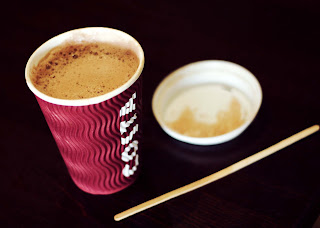
I like these images because of the dark background. It gives a good contrast to the product and makes it more dynamic. It reminds me of the images by Edward Weston where his images also showed a dark backdrop. I like the second shot the best out of theses two, but the content may look better visually if it was lightened slightly. I like the texture of the corrugated cups, as I think it adds to the overall look visually. I think I will try to reproduce 


Uniformed, Documentary Style 
This image, again reminds me of Edward Weston's work because it had a uniformed, documentary feel to it. It has a similar use of space around the edge and has a dark background like the images he created. I feel this is one of my strongest test shots and I would like to re-create it in my shoot. Again, I like the texture and contrast of the cup, this is due to the lighting and actual shape of the product.

Conclusion.
Overall I think I created some good images in during my test shoot, and I would like to try and recreate a few of them as well as trying out some new ideas talked about in my initial mind map. The main new concept I would like to try is movement.